Archives for posts with tag: minimalism

An interesting post from Aaron Schmidt at Walking Paper on the merits of simplified library web sites.

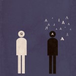
Antoine de Saint-Exupery, a daring pilot and talented author, also weighed in on user experience:

“In anything at all, perfection is finally attained not when there is no longer anything to add, but when there is no longer anything to take away.”

In some ways, libraries have been taking the opposite approach. We’ve gotten in the habit of tacking on new services and taking on new responsibilities, and many library websites can be seen as piecemeal collections of patron engagement tactics…

There are two ways to increase the amount of attention the bits of a website receive: either by increasing staffing and funding, or reducing the number of bits. An extreme example: imagine if your web team was only responsible for the page consisting of your library’s contact information, location, and one book recommendation per week. They’d be able to spend plenty of time on this page, testing, experimenting, and revising regularly. It would be a great page.

For years, I’ve heard talk about libraries cutting the cord on irrelevant services. Yet I haven’t heard as much discussion about which sacred web cows we can put out to pasture. This might in part be owing to the perception that a 200-page website isn’t more expensive to manage than a 50-page one. While probably true in terms of hosting fees, it isn’t otherwise true. Good content takes staff time to produce and arrange, and the navigational overhead can be a time expenditure for users.

I’m not suggesting that libraries shouldn’t try new things or add content to their sites. They should. Still, the library world needs to start a dialog about an additional way to prevent stagnation: subtraction.[read the full post]

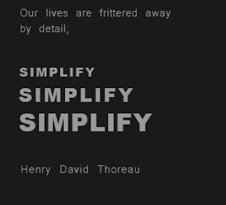
People following this blog know my affection for minimalism as a creative conceit. Apart from aesthetics, I really believe there’s merit to simplifying library online experiences (something I’ve argued for in the past).

Schmidt takes aim at the current library web-design ethos of trying to stake as much online territory as possible. But, enthusiasm and ambition can be a downfall. There are many library landing pages with so many content and navigation options that it’s difficult to really find specific things. Read the rest of this entry »

Reference Tshirt

I had some extra time last week, so I’ve been able to finally roll this out.

Fans of this site and of my Library Minimalism series can get in on the action.

You see, Drop the Reference Bomb’s merch store is now live!

Right now, there are posters, mugs, t-shirts, and totes that feature the best from my Library Minimalism prints. More items and prints will be added as inspiration and time allows, but I think I’m off to a good start.

Circulation Mug

Why Zazzle?

Because it’s customizable!

Don’t like the colour, fit, type of shirt? Want a stainless steel travel mug instead of a ceramic one? There are lots of options to choose from. I’ll start you off, but the final choice is up to you!

There are lots of library themed stuff out there, but I guarantee there’s not much like this! Plus, big spenders ($50 or more and not just at my store) from the US can get free shipping. I’ll also keep everyone posted about sales as they happen.

Cheers!


Another entry in the Library Minimalism category: Virtual Reference.

Though, I suppose if an actual poster looked this rough and was hanging in your library, you’d want to replace it. Or, more likely you’d want watch out for wandering hordes of mutants.

I swear I’ll get back to regular posts soon, but these minimalist pictures are just so much darn fun.

Circulation!
I was in a meeting about MODS and XML (A schmancy new digital cataloguing methodology – dry conversation, but useful stuff.). Something clicked, and I had the inspiration for a few more Library Minimalism pictures. 

I should scan the page. Anyone who knows me from library school at Western probably knows I take unique notes. Heh, not that I wasn’t paying attention. Also, Science supports the habit.

“Circulation” is the first of the two, or maybe three, that will come out of that meeting.

I’m also working on setting up a web-store. Soon, you’ll be able to buy Library Minimalism posters and other Drop the Reference Bomb swag. Nice, right?

cataloguing
And here we go, another addition to my library minimalism project.

The key thing for this one is the human connection. At first, I wanted it to appear more cyclical, like a triangle… but there’s something elegant about the role a good catalogue or database plays in connecting people to things, so I went with the linear flow.

Also, I couldn’t resist the retro library card catalogue type card. I’ll have to do “OPAC”, eventually. I have no idea what that would be.

Part of my heart is librarian, but another big part is a driven by design. And, I love to find ways to confine the two.

Inspired by Jamie Bolton‘s Minimalist Movie Posters, I started my own “Library Minimalism Project.” The idea is to take issues and facets of library and information science and reduce it down to it’s brass tacks. And then, express it visually as simply as possible.

These are the first two:

There is something to be said for considering parts of our field at a very distilled level. So far, it has been illuminating to boil down what are essentially complex and sometimes abstract ideas.

Check these out. I’ll be posting more as I finish them!